I am a long-time member of Irving Art Association, which is now celebrating its 60th Anniversary with a special challenge category in the annual juried membership exhibit. The challenge entry has to relate in some way to the Irving Art Association or the 60th Anniversary. Entry deadline is May 3, 2105.
THE INITIAL PRINT PROCESS
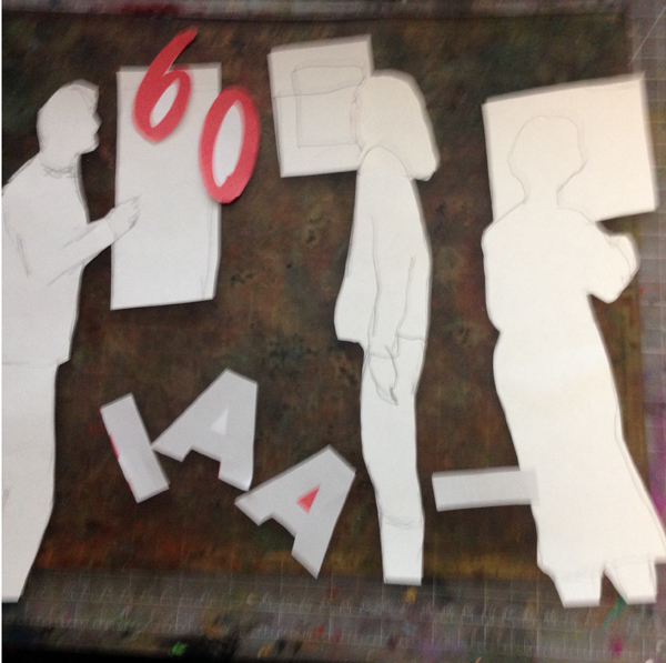
So I reviewed my old photos of IAA and selected three figures viewing paintings to incorporate into a monotype started on my Gelli Plate. I used the thinner acrylic paints from Golden (liquid and high flow) for transparency, thinned with medium. If you layer yellow, red and blue, you can almost achieve a black.
I created masks for then letters “IAA” and numbers “60” as well as the figures and rectangular painting shapes. I sequenced colors from the lightest (yellow) to the darkest (blue). Here are some illustrations of the process, which involved six layers of printing using acrylic, stencils and masks.

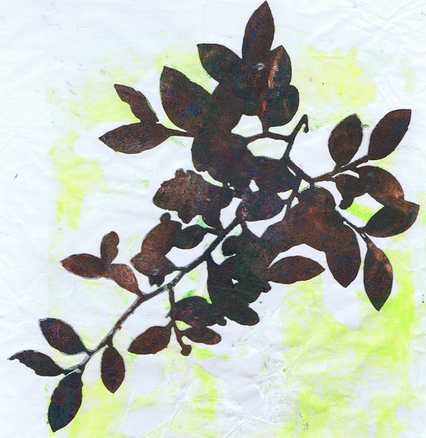
showing cut masks on gelli plate

First layer of yellow – the medium picked up residual paint on the plate

showing tape on the back of a mask, which were stuck to the watercolor paper

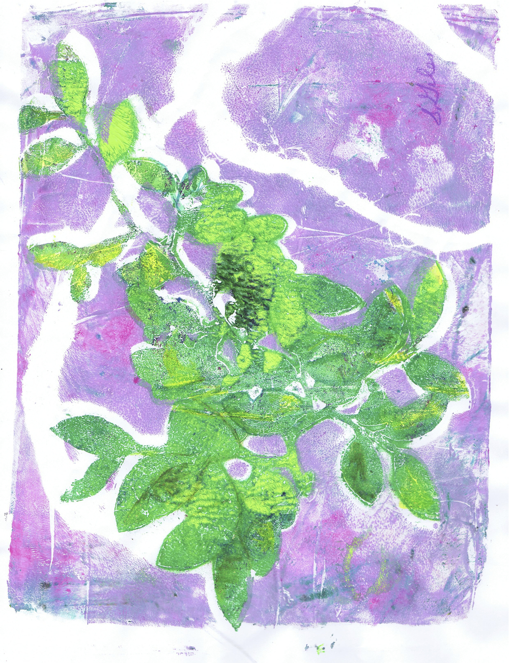
second layer of yellow on print

layer of orange (masks are still attached)

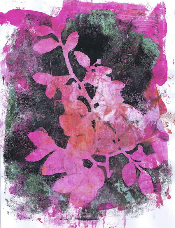
magenta and blue layers added (on top of masks)

magenta and blue layers added (masks removed)
FINDING THE SUBJECT
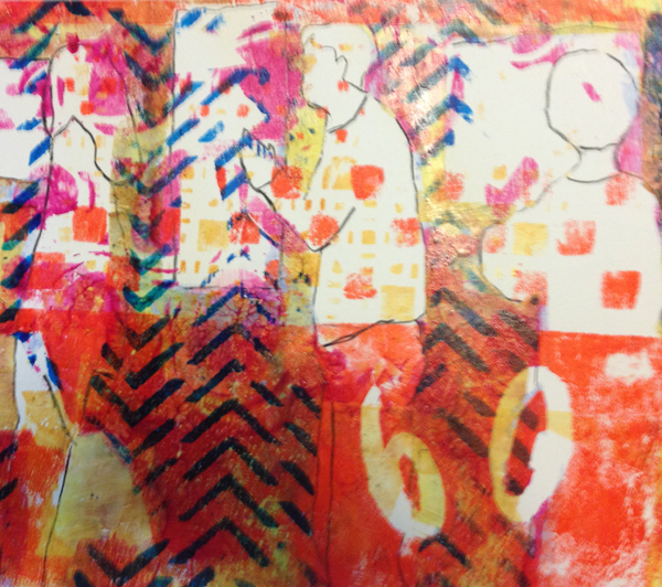
This is as far as the monotype process goes. It looks like an unpromising mess, but I’ll do my best to pull interesting images out of that! The rest is alteration with colored pencil and brushed on acrylic. Sneaky negative painting techniques….

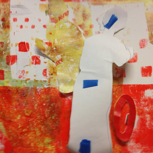
lines added to figures to start to separate them from background

Transparent dark blue background layer added by painting directly to pop figures and logo. Blue and orange painted hair. Logo changed to orange.
THE SELF CRITIQUE
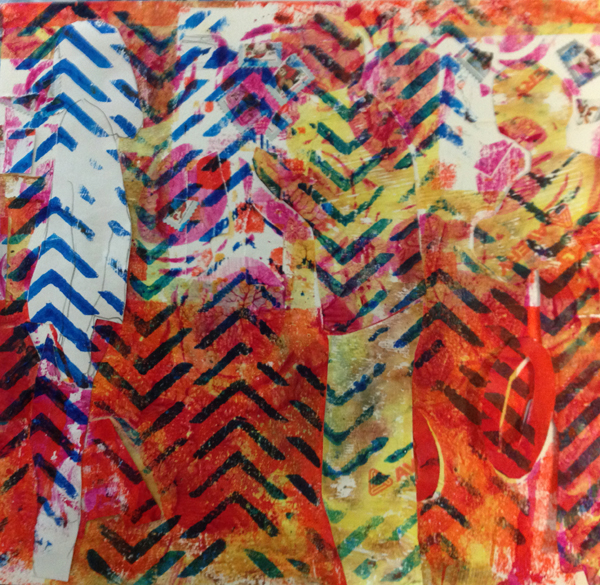
Now comes the evaluative process…wow, I’ve got a lot going on. Somehow I decided that this would be an orange-blue complementary color combination. Unfortunately, in color field extension theory, the most pleasing combo of blue to orange is 3/4 blue, 1/4 orange (next would be the reverse). So I’ll have to make some changes — maybe I’ll paint the areas that I want to turn blue, white first, then recover them.
And where is my focal point? Got to decide although I could contemplate going for the checkboard effect design structure first. It’s almost there.
I love these paintings where I don’t know exactly where I’m going – you can get some pleasant surprises when your paintings evolve. Or not. O well, it’s only a paint struggle, not like the major surgery I just went through.

About seven brief sessions of tweaking …I scan and discover more is needed

“The Critics (IAA 60th)” – Finished? Maybe.
TWEAKING
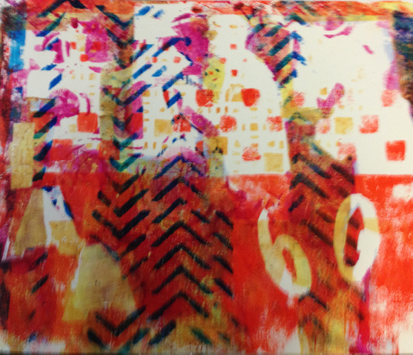
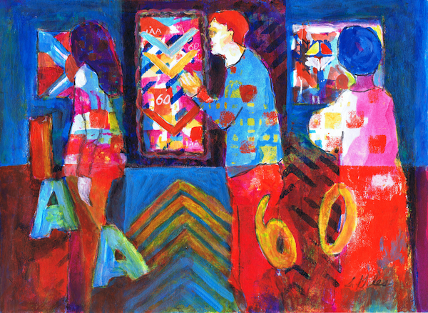
This is the part where I try not to work the painting to death, but accomplish my aims. So I adjusted the orange to be a little less saturated and changed some areas to blue tones. Now there’s a lot more blue, and I’m liking it more. I’ve also added more yellow and magenta, so there’s almost a primary color effect going on. It is a little garish, but it’s happy.
I’ve stayed with the idea of the checkerboard design structure, even though the top and bottom are close to equal. And the main subject is close to the center – well, if I like it what does a design no-no matter? Tried also to improve the mini-compositions of the paintings. Contemplating simplifying even more. I have a few more days left before I have to submit the artwork for the exhibit, so things may change more.
FINISHED YET?
Update: Yes, I had to meddle more with it, further define the checkerboard pattern, and repeat the chevron pattern in the mini-compositions. Plus there’s more happy blue and yellow. Stopping now, I’m telling myself. I need to work on my third entry. Not everything has to be a masterpiece, it’s really all about the process.

Finished version “The Critics (IAA 60th)”
FURTHER UPDATES
“The Critics (IAA 60th)” didn’t win the Challenge prize, but it get 3rd place in Mixed Media at the Irving Art Association 2015 Members Juried Exhibition.
Also, I had the piece critiqued by Jane Jones, so I may follow some of her suggestions after the show is over and tone down more of the orange and intensity, going for still more blue dominance.